NavList:
A Community Devoted to the Preservation and Practice of Celestial Navigation and Other Methods of Traditional Wayfinding
From: Greg Rudzinski
Date: 2016 Jul 26, 17:56 -0700
Robert,
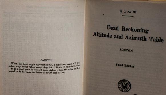
In place of Sadler or interpolation it may be better to use Ageton in a completely different way when faced with problem (t) values. Attached is a PDF of a compact Ageton 1' A B table with natural sin cos values side by side. This lets the Ageton A and B log values solve for Hc using the spherical law of cos method. See example attached showing the same pseudo observation solved both ways. Each method takes the same amount of time to reduce. The table fits on 6 standard sheets of paper if using both sides.
On a critical LOP it may be worth reducing by both methods to produce the same Hc and boost navigator confidence.
Greg Rudzinski
From: Robert VanderPol II
Date: 2016 Jul 26, 16:35 -0700On 2016-07-25 22:33, Robert VanderPol II wrote: > The value I would think most important would be max error. Where would you draw the "unacceptable" line? I have started to write up some conclusions, based on a max of 5', but I'd like to hear what others think. Note that an absolute limit at 5' or any other value is maybe not realistic. To get the max error I use a run of one million tests, since the value jumps around noticeably with only 100,000 tests. In other words, the really bad Ageton reductions occur in highly specific conditions and are statistically rare. And we'd normally detect those sights from the appearance of the plot. For instance, vanilla Ageton has a max error around 32', but 99.3% of sights are within 5'. If we stipulate that, say, that no more than 0.1% exceed a certain threshold, that may be a more meaningful standard to shoot for.
I would draw the line somewhere between 3' and 15' depending on where I was in terms of hazards and how many bodies I was able to shoot. I don't want to establish a firm line for acceptablility because such a line should be situation dependant adn user dependant too. I think a good goal would be to present the statistics in a way that allowed Ageton users to make educated decisions about how much to trust their results. If it were possible to create one or several graphs that show various statistics I think that would be very helpful to to more experienced users by helping them understand the limits of the results they are getting.
Possibly everything could be put into one graph. The x-axis would be "t", left y-axis would be "%" with lines for "errors exceeding 5' ", "errors exceeding 8' ", "errors exceeding 12' ", with a repeat of all these lines for interpolation. right y-axis would be " arc-minutes of error" with lines for RMS and Max error, both repeated for Interpolation. Maybe use different colors for the different y-axes.
Have you seen Samuel Herrick's paper on this problem?
-Pub-211-Redx.jpg.thumb.jpg)

