NavList:
A Community Devoted to the Preservation and Practice of Celestial Navigation and Other Methods of Traditional Wayfinding
From: Sean C
Date: 2020 Apr 2, 23:56 -0700
Antoine,
You asked:
"How did you proceed to draw such nice looking curves ?"
The first thing I did was to use Stellarium to get a rough idea of when the minimum separation occured. I then used USNO's MICA to calculate the positions of each body for each minute over a 24 hour period. I copied the data over to Excel, calculated the separation values and generated the charts. After I found the time of minimum separation to the closest minute, I repeated the process for each second over a one hour period.
What I find interesting (and you can see this in the plots and in my spreadsheet, attached) is that the curves are not smooth. The separation distance decreases and increases very tiny amounts within the parabolic trend. I don't know if this is due to the geometry of the Earth, Mars, Saturn and Jupiter and their motions, a rounding error in MICA's data or something else entirely. MICA gives R.A. to seven decimal places in degrees or three decimal places in hours, minutes and seconds. Declination is given to six decimal places in degrees or two decimal places in DMS.
If I had used only the first iterations (with the data calculated for each minute), my answers would have been different because of these variations.
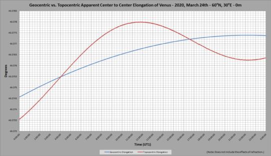
Perhaps also related (or not): when Tony Oz was talking about geocentric vs. topocentric observations of the Sun and Venus (see: here), I decided to see what the difference would be (without the effects of refraction, which MICA does not include). To my surprise, the topocentric elongation was far from smooth - or parabolic. (See attached image and spreadsheet.) ... Interesting.
Regards,
Sean C.
